Start a brief

Selected work

Work we can talk about.

This page is a reading guide, not a trophy wall. We describe sector, task, craft and format so you can judge whether the studio is a fit. We do not publish client names, logos or performance figures — those belong to the companies that paid for the work.

We publish scope, craft and process rather than client logos or performance numbers. Examples here are drawn from the kinds of engagements the studio takes on; names, contracts and client data stay private.

Hamilton, ON

Cold-brew coffee roaster

A Hamilton roaster was moving from market stalls into grocery and needed a pack system that could sit next to national brands without shouting. The existing labels had been drawn one SKU at a time; flavour notes, brew methods and bilingual legal lines did not share a grid.

We rebuilt the architecture around a single tasting panel, a colour code that still works under supermarket LEDs, and a French block that does not collapse the English. Press checks were held at a Mississauga plant so we could watch how the uncoated stock took the dark brown.

Retail staff received a small launch kit: a corrugated shipper that doubles as a counter riser, recipe cards and a one-page wholesale sheet. The system now covers six SKUs and was drawn to accept two more without a redesign.

  • Six-SKU label system and dielines
  • Corrugated shipper and recipe cards
  • Wholesale sell sheet and staff tasting notes
  • Press-ready PDF/X and a short production guide
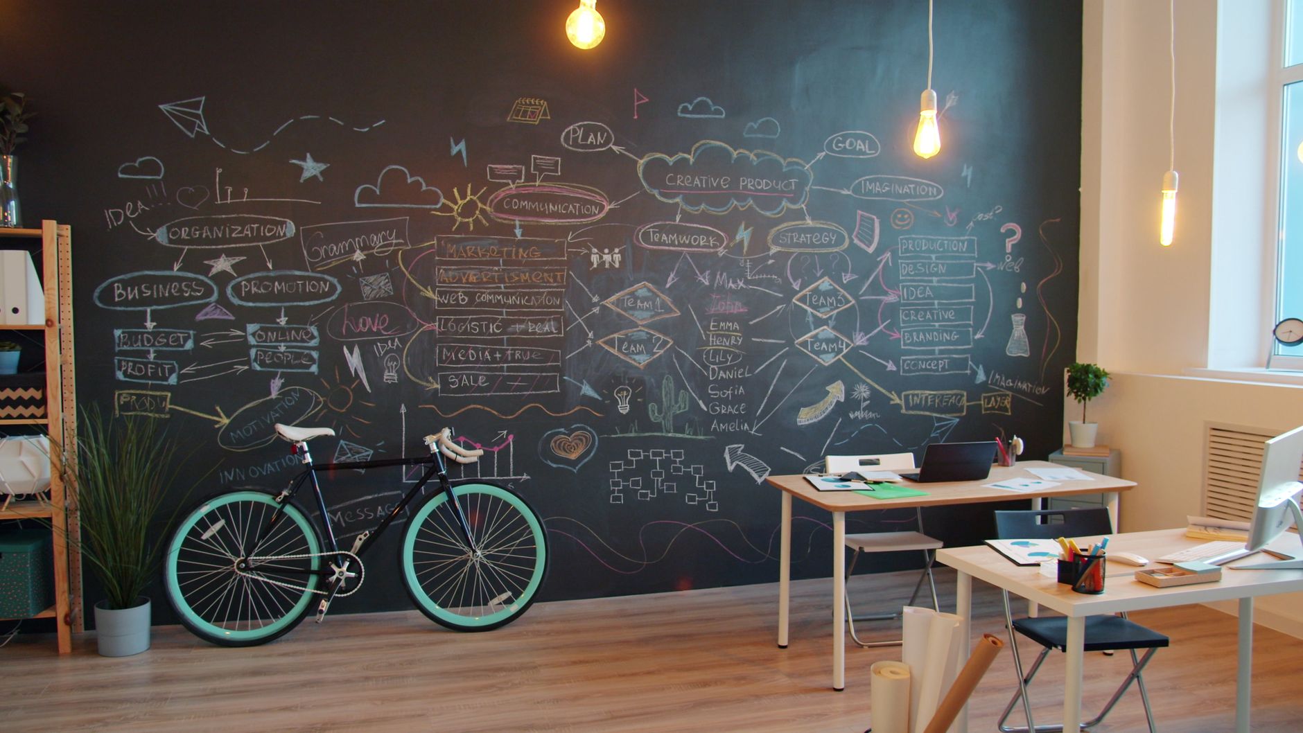
Planning wall, bicycle and a studio desk
Sector
Food and drink
Scope
Packaging system and retail launch kit
Duration
11 weeks
Format
Project

Ottawa, ON

Multi-site dental practice

Three clinics in different Ottawa neighbourhoods were introducing themselves as if they were three companies. Patient pages used different service names; local listings had drifted; the exterior signs no longer matched the stationery people took home.

We wrote a single patient-facing vocabulary, refreshed the mark so it could be cut as vinyl and embroidered on a tunic, and reset Google Business Profiles so hours, services and photos stayed in one place. Photography was briefed, not invented: waiting rooms, not stock smiles.

The work stopped at the front door of clinical claims. We will not write treatment outcomes we cannot source. The useful change was quieter type, clearer wayfinding and a phone script the front desk could keep on a card.

  • Brand refresh and messaging guide
  • Exterior signage drawings
  • Listing hygiene and patient-page copy
  • Photography brief for three sites
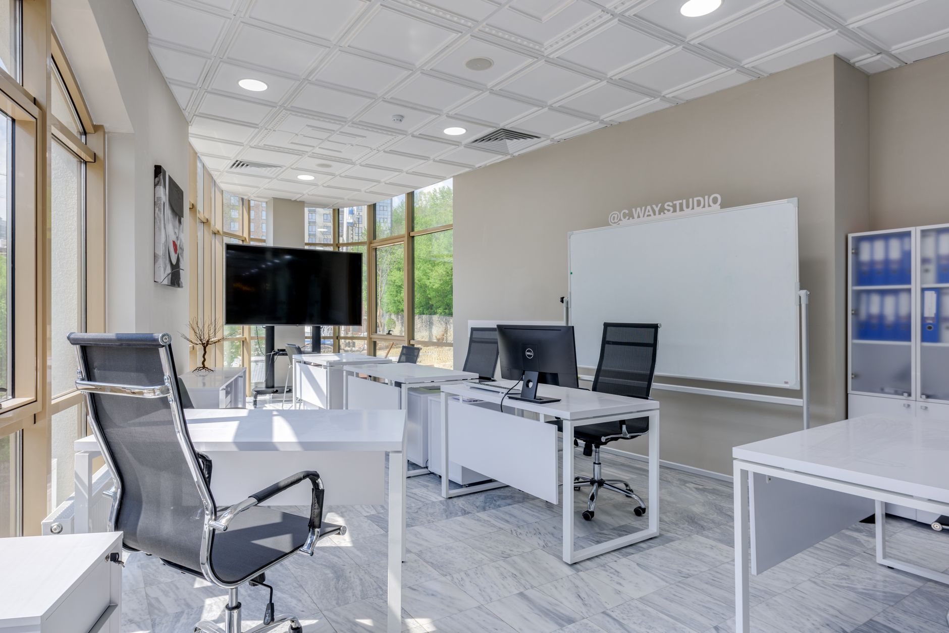
Studio workroom with white desks and a monitor
Sector
Health services
Scope
Brand refresh, messaging, local search hygiene
Duration
9 weeks
Format
Project

Whistler, BC

Outdoor gear rental

A rental desk on the mountain needed seasonal campaign art that could swap when the snow line moved, and a booking page that did not abandon people on a phone in a gondola queue. The old site treated inventory as a brochure.

We art-directed a stills set that works in rain and in hard light, rebuilt the booking flow around real SKU constraints, and wrote cancellation copy that a guest can finish before the lift starts. French was planned from the first wireframe because a share of guests arrive from Québec.

The campaign boards live as a kit: posters for the village, stories for owned channels and a desk card so staff repeat the same offer. We did not attach a percentage to the rebuild; the test was whether a guest could finish a booking without a phone call.

  • Seasonal art direction and stills brief
  • Booking-page rebuild
  • Village poster set and desk card
  • EN/FR cancellation and kit language
People reviewing papers at a meeting table
Sector
Travel and leisure
Scope
Campaign art direction and booking-page rebuild
Duration
8 weeks
Format
Project

Montréal, QC

Food hall operator

A food hall operator needed an identity that could host a dozen vendors without turning the concourse into a collage. Menus had to work in English and French, on a board and on a phone, and wayfinding had to survive a Saturday crowd.

We drew a host mark that stays quiet so vendor colour can be loud, then built a bilingual menu system with a shared type ramp and allergen line. Wayfinding was tested at walking speed: if a guest has to stop to decode a floor, the sign is wrong.

Printers in Montréal ran the first boards. We stood on the floor for the install and adjusted one arrow that pointed at a column. The files now live as a kit vendors can use without calling the studio for every daily special.

  • Host identity and colour rules
  • Bilingual menu system
  • Concourse wayfinding
  • Vendor kit and production notes
Open studio floor with facing desks and pale chairs
Sector
Hospitality
Scope
Identity, bilingual menus, wayfinding
Duration
14 weeks
Format
Project

Mississauga, ON

B2B logistics software

A Mississauga software team had a product that dispatchers understood and a website that spoke as if the buyer were a conference. Positioning had drifted into slogans. Sales were carrying a deck that did not match the product screens.

We sat with sales and with two customers who would talk on background. The new territory is operational, not visionary. The site was rebuilt around three jobs — quote, integrate, report — and the collateral was cut to a two-page leave-behind plus a demo script.

We do not publish pipeline numbers. The studio’s test was whether a new business-development hire could run a first call from the site and the leave-behind without inventing a fourth story.

  • Positioning document and message map
  • Marketing website, design and build
  • Two-page sales collateral
  • Demo script and screenshot kit
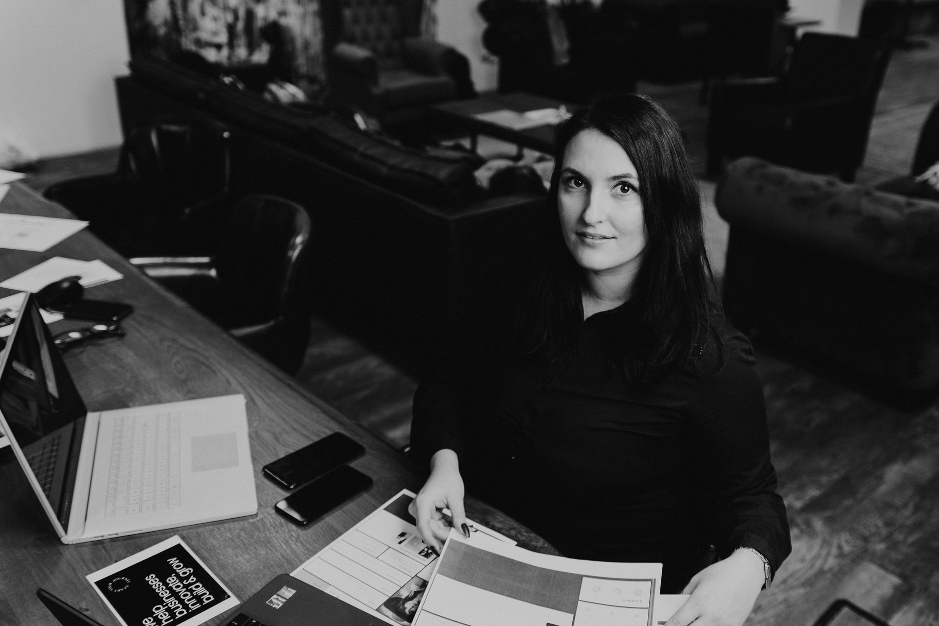
Reviewing printed page layouts at a desk
Sector
B2B software
Scope
Positioning, website, sales collateral
Duration
12 weeks
Format
Project

Kitchener–Waterloo, ON

Community-supported farm box

A CSA in Kitchener–Waterloo needed subscription pages that explained a seasonal box without pretending every week looks like August, plus print inserts that survive a damp crate and emails that do not nag.

We wrote the landing pages around frequency, pause rules and what happens when a crop fails. Inserts use a stock that can take a splash. Retention emails were built as a short lifecycle: welcome, pause, restart, end-of-season — not a weekly newsletter nobody asked for.

Photography came from the farm and was cropped, not replaced. The studio’s job was sequence and clarity, not a lifestyle campaign that would look wrong in November.

  • Subscription landing pages
  • Crate print inserts
  • Retention email set
  • Pause-and-restart copy
Wood cabinetry and a compact studio desk
Sector
Food and community
Scope
Landing pages, print inserts, retention email
Duration
7 weeks
Format
Retainer (build, then monthly care)

Reading

How to read a facts block

Sector names a category, not a client. Scope is the work we actually made. Duration is studio calendar, not print lead time — a pack that needs a press slot will sit longer than the weeks on the card. Format is Project or Retainer: a closed job, or a monthly block after the first build.

We do not add percentage lifts, ROAS or “nps” scores. If a number cannot be published without a client’s consent, it does not belong on a public page. The useful question is whether the craft described here matches the job on your desk.

Privacy

What stays off this page

Contracts, invoices, customer data, and the names on the door stay private. We will not mock up a logo wall to look busier than we are. If you need a private walkthrough of a closer example, say so in the brief and we will tell you what we can show under an NDA.

After

What happens when a project ends

You leave with a named library, production notes and thirty days of care. If the work needs a monthly pair — new SKUs, a seasonal kit, listing hygiene — we quote a retainer. If it does not, we close the calendar and remain available for a later studio day. We do not convert a finished project into an open-ended “always on” relationship without a new written scope.

Fit

How we choose projects

We take work where a pair can stay with the job, where production is real (a press date, a launch week, a store opening) and where the client can name a decision-owner. We decline work that needs a crisis desk, invented medical claims, or growth tactics that manufacture reviews.

If your project is a fit, the next step is a listening session — not a speculative deck. We would rather send a short no than a long maybe. Mid-sized Canadian companies, independent retail, food and drink, clinics, B2B software and cultural organizations are the profiles we already know how to schedule.